ENGL 596 - Analysis of NOLITORY, Nonlinear Film Analysis Tool
NOLITORY is a story exploration tool that visually, through a series of graphs that a viewer can manipulate and explore, arranges the narrative of selected films in accordance with user-selected parameters.
This post is an exploration of the story exploration tool, its uses and functions, and an analysis and evaluation of its design. The Nolitory Explorer tool allows for users to examine nonlinear visualizations of popular films. The current iteration of the web tool features nonlinear analysis of the following films (click links to open IMDB page and to see the film trailer in a new window):
- Pulp Fiction
- Memento
- Eternal Sunshine of the Spotless Mind
- The Usual Suspects
- 500 Days of Summer
- Fight Club
- Reservoir Dogs
- 12 Monkeys
- The Prestige
- Annie Hall
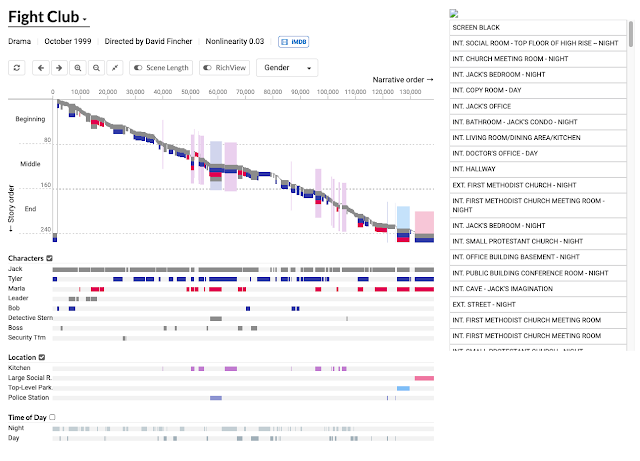
In examining this web tool, I aim to evaluate its design and to explore how the tool might be used. To begin, let's examine the web page layout of the tool. The page design features a no-frills layout on a white background. There is no explanation of the tools intent or design on the page. The user sees a drop down menu (indicated by a small carrot icon) that features the film titles in larger, bold font than the rest of the page. Beneath this feature that functions as a title element are listed film details that include genre, release date (month and year), director, and the films nonlinearity score (more on that in a minute) followed by an IMBD link.
 |
| Nolitory graphic display of "Fight Club," arranged by gender |
The second row design element features a series of navigation buttons, two toggle switches for scene length and rich view followed by a drop down menu that allows the user to select data arrangement. The three categories for data arrangement are under the heading "Characters' and the drop-down allows the user to select from three options: Genter, Sentiment, and Characters.
Immediately below the navigation tools, the page features an active chart/timeline with color codes that correspond to menu selections. There is not, however, any sort of legend to interpret the data. The author clearly aimed for the color codes to differentiate meaning, and in some cases, the colors may be intuitive, but whether this is coincidence or intentional is unclear. Below the graphical display, characters, locations, and time of day are depicted in video-timeline fashion without vertical variation. All of these characteristics shift and adjust according to the diplay settings for the data.
Fight Club's nonlinearity score is 0.03 and for those familiar with this film it makes sense. The film is told as a recollection of events, and the events are recalled in very linear fashion, from beginning to end. The film trailer also reflects this linear narrative. see for yourself:
Review the trailers or watch the films again and then either explore Nolitory or examine the screenshots below. The (non)linearity of the films, when combined with graphic displays and the ability to expand the screenplay offers a great way to make meaning of the narrative when viewed through different lenses, such as the dominance of gender roles, the overall timeline, etc.
 |
| Nolitory graphic display for "Reservoir Dogs," arranged by character gender |
 |
| Nolitory graphic display of "Reservoir Dogs," arranged by default |
If you want a very scholarly analysis of narrative, feel free to check out this work, "An Introduction to the Structural Analysis of Narrative," by well-known philosopher and scholar, Roland Barthes.
Now that we're all up to speed on narrative, linear or nonlinear narrative depictions, and what Nolitory can do for us, let's briefly evaluate how well it is designed from a user perspective. For this, I will refer to Douglas Eymans Digital Rhetoric: Theory, Method, and Practice (full text PDF available here).
Eyman references "one of the earliest definitions of rhetoric" by Aristotle: "the art (techne) of finding out the available means of persuasion" for a given argument" (qtd in Eyman 14). And, according to Aristotle, by way of Eyman, we can distill rhetoric into five components: Invention, Arrangment, Style, Memory, and Delivery. While this might not feel like fair comparison for a web tool, for argument or discussion's sake, I'll evaluate Nolitory according to these five categories.
"Invention: Finding the most persuasive ways to present information and formulate the argument" (Eyman 14)
I think the creator of Nolitory did a solid job of proving the linearity or lack of linearity for the films he chose to analyze. Once the viewer is familiar with the layout and graphic depictions of the tool, it is fairly easy to recognize the narrative structure of the film. It is clear, for example, when reviewing the charts for Fight Club, that the film is laid out in a chronological, linear narrative. Reservoir Dogs, on the other hand, is clearly more complicated in its narrative structure.
"Arrangement: The organization of the speech" (Eyman 14)
Here, I think we can point out a defect of the Nolitory web site and tool. While it is reasonably straight forward and not overly complicated to decipher, the complete lack of a legend or instructions of any kind (not to mention no statement of intent whatsoever) leave the user/viewer/reader wanting more.
"Style: The use of appropriate forceful language" (Eyman 14)
The layout and colorization, supported by the script/screenplay, to me, is evidence of the appropriate amount of force to prove the author's point. While we might analyze the timeline and judge events from memory after watching the film, having the ability to read the dialogue at any point of the storyline in the right margin adds both weight and authenticity.
"Memory: Using mnemonic devices so you don't forget your lovely style arrangement" (Eyman 14)
Again, application of this standard to this tool may seem like a bit of a reach, but I'm going to say that the addition of the screenplay, linked with the graphics, works well for the user. The user, can recall any moment in the film with a click and have the dialogue at hand. This works well for both author and viewer.
"Delivery: Presenting the speech effectively" (Eyman 14)
I'd have to give the author a B- here. The site works, and we can make use of it to draw conclusions, but he absence of any intent or explanation leaves us wanting. A Google search yields a GitHub page that has some technical data regarding the project and contact information for the author, but there is no “about” page or any other explanation of the purpose of the project, its intended use, or the design choices or philosophy.
That wraps up this exercise for now. The ever-expanding availability of digital tools for creation and analysis of creative content is an exciting phenomenon. However, when building/designing/imagining these works, it is beneficial to communicate the why's and how's as with any other, more traditional project or medium.
If you've made it this far, thanks for sticking around until the end! Here's your reward:
(GRAPHIC CONTENT! It's okay if you don't watch.)
Works Cited
Barthes, Roland, and Lionel Duisit. “An Introduction to the Structural Analysis of Narrative.” New Literary History, vol. 6, no. 2, Johns Hopkins University Press, 1975, pp. 237–72, https://doi.org/10.2307/468419.
Eyman, Douglas. Digital Rhetoric: Theory, Method, and Practice. University of Michigan Press, 2015.
Nolitory. https://storyexplorer.namwkim.org/


